Thursday, April 28, 2011

| Easter Party |

Welcome to Easter in Candy Land! One of our client's requested our help to throw an Easter party for the Kindergarten classes at her son's school. We were thrilled at the opportunity to throw a bash that would be enjoyed by a group of fun young children. For weeks, our office has been filled with everything from building insulation to beach balls to pull off the decorations seen in the following pictures and we enjoyed every minute of it! 
Above is the entrance into life-size game board where the children were given t-shirts coordinating with game pieces and divided into teams. We had giant candy bars greeting the anxious group of young boys and girls, needless to say, it got them excited for the candy-themed day of fun!
At Lollipop Woods, the kids made candy necklaces which proved to be more popular as a delicious treat, than a pretty accessory. The lollipops decorating the station were created from styrofoam discs and balloons wrapped in multi-colored cellophane. The bright hues were the perfect match against the kids' high energies. Once they had made it through the woods, they landed at King Kandy's Bar where the children continued their candy adventure and filled their own plastic bowls to the rim with a variety of sweets. 

It was the Chocolate Swamp where the mess began! Each child was allowed to dip a cookie or a piece of fruit into the delicious chocolate fountain that was provided. A river of chocolate flowed from the trees and was achieved by spilling brown theatrical fabric over the limbs and into Gloppy's swamp.
Peppermint Forest was exciting for the kids as each marveled at the giant red-and-white striped sticks coming from the ground. This was achieved by cutting and wrapping PVC plumbing pipe with red electrical tape. It was here that the kids enjoyed some art (which was a nice retreat from the sugar overload!), and each was allowed to paint an Easter egg.

When the game was finished, the children had one more surprise left. The Easter Bunny was waiting for them to join him and hunt eggs! After each received their own basket, they set off into a field that had dozens of hidden eggs waiting to be found. 

Thursday, April 21, 2011

| Spring Events |

This week is flying by! We have been busy with our normal hectic schedules and getting ready for a big event that is taking place tomorrow. It's a Candyland-themed Spring party for kids of all ages. We've made ice cream cones out of spray foam insulation, centerpieces out of lollipops, and that's just the beginning. We can't wait to share pictures with you next week!

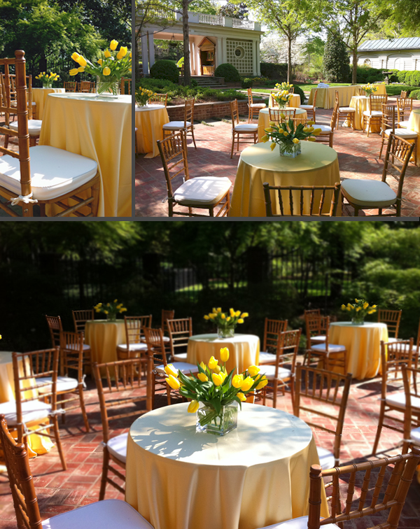
Until those fun images appear, we would like to share with you a more adult party that we planned last week. The event was an awards ceremony for a client. The lovely yellow tulips and table linens combined with the natural wood chivari chairs were the perfect setting for a beautiful Spring night.

Tuesday, April 19, 2011

| The Latest Thing: Lacquered Walls |

If there is one room that sticks out in our mind when thinking of lacquered walls, it would be the Brooke Astor's red library done by Albert Hadley. It is the quintessential room that is perfectly balanced with highly dramatic walls and classic prints and design elements. It was done beautifully then, and is still a classic trend that brings walls to life and gives an opportunity for change from the standard flat paint finish.

Painting a room in a lacquered finish is a technique designers from Alex Hampton to Billy Baldwin have made popular. The high gloss effect adds instant drama and gives an air of elegance to a space. The way light shimmers off lacquered walls at night in a room is impossible to achieve with any other finish. The technique is most appropriate when using darker colors and is almost magic when used in a room like a dining room or powder room and accentuates every aspect of the room around it.
We used the high gloss finish in both of these dining rooms and the outcome was exactly what we had intended for the spaces: glamourous and unexpected. 

One thing to keep in mind when incorporating this trend into your home is the condition of your existing walls. They must be in good shape to pull this look off, otherwise, this finish will show every flaw. Also,  it's important to keep the level of sheen consistent, so be sure to include your trim and base in the same paint.
    

Friday, April 15, 2011

| Featured Find: Ladder Chair |

April’s Featured Find is a unique piece that is great for any room in your home. It adds interest, personality, and function. Roger picked this up on his last market trip from one of his favorite English antique dealers. It is a showroom piece that gets a lot of attention for its innovative transformation and beautiful appearance. We only have one, so hurry in if you need a great bit of character for your home!

Monday, April 11, 2011

| More Inside the Home |

We introduced you to the Byland's beautiful house on Wednesday, but intentionally left out some of the best spaces of the house to ensure your return! 

Starting with the Powder Room, it is located right off the entrance and has a truly distinctive style. In keeping with the natural yet elegant ambiance of the house, we paired a tree stump with a stone top to create the vanity. Then to bring in a graceful element we added a modern glass sink and a linen upholstered octagon mirror. The painted side chair placed in the space adds a touch of fun!
   
Next, we have the girl's bathrooms, and as promised they are equally as unique as the girls who live in them. While the first one is subtle yet lovely with a pop of color, the second two go much bolder with their color pallete. Each has a feminine and youthful sense to the space.
Last, but definitely not least, is the master bath. This room is the epitome of elegance with a crisp white porcelain tub and soft sheers to allow the natural light to flow in. A calmness embodies the room with it's rich stained cabinets and they are the perfect contrast to balance the other feminine touches in the room. The polished nickel finish on the sconces and hardware adds sophistication, while the full length window is a great source of natural light. Together the combinations of these elements create a space that embodies relaxation.
We hope this post gives you inspiration on how to combine your appreciation for the outdoors with your elegant taste. It's not as hard as it sounds anymore, is it? Even the most rustic pieces can be sophisticated when used correctly! The juxtaposition of the organic, earthy elements in this home with the modern, clean design makes the  home so special! Many thanks to the Byland family for allowing us this peek inside their wonderful new home.  We hope you enjoyed your tour!

Wednesday, April 06, 2011

| Inside the Home |

Today's post  introduces you to a house that we recently completed.  It is  the home of Jim and Mary Byland and it is a delight for the senses. It embodies the spirit of the lovely people who live there.  The mood is calming without being boring and elegant without being stuffy.  The high ceilings and full length windows in the main gathering area allow for an open, relaxed setting.
.   This is a family who truly feels at ease with an interior that brings the outdoors in.  They have an equestrian spirit that is embodied throughout the house. A combination of hand hewn beams and stacked stone creates a rustic yet sophisticated environment. 
Grasscloth wallcovering covers three walls in the office. The space is layered with textures beginning with the walls, followed by the reclaimed wood demi-lune table, the nailheads on the chairs, and finally with the flokati hide draped over the ottoman.
The next room to introduce is the office.  Because of their love for cycling Roger had the idea to mount a vintage bicycle on the wall above the custom made desk.  This adds a sense of energy and personality to the space that tells the story of its owners. The panelling above the desk creates a warm, rich accent wall while complementing the natural components of the grasscloth wallcovering.  And now for the bedrooms.........
The children's rooms are located upstairs and have a huge amount of personality (much like their occupants!!!).  They are perfectly suited for each of the girls who live there.  Built in lofts and ladders are a big hit while adding a design element that defines the space while keeping a sense of youth for the overall concept.

Later this week, we will share some photos of the bathrooms of this house. Each is so unique and beautiful that they deserved a separate post! Stay tuned!

Friday, April 01, 2011

| Before & After: Showroom |

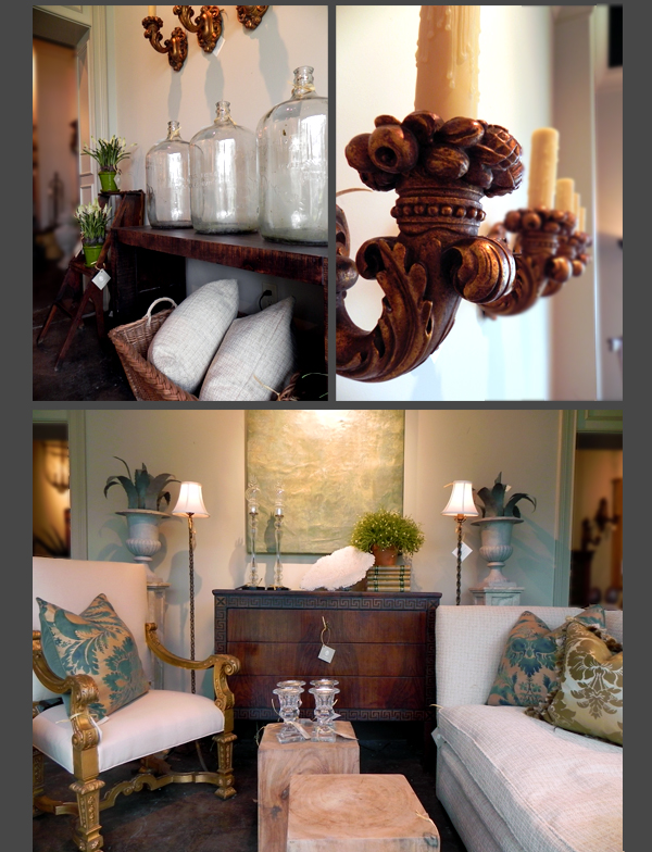
Sometimes you just need a change, our showroom is no exception.  Sure, we create an enormous mess while shuffling around sofas and chests, but the outcome is always a fresh and exciting way to showcase items that have gone unnoticed.
The front window is always the main attraction of our showroom, so it must stay up-to-date. While it was beautiful before, it felt more appropriate for the winter season with its cozy furniture and the lack of color in the accessories.
Creating a new window for the warmer days was simple. We made the furniture lighter and the accents have a little more personality. Also, the white garden benches and wooden blocks for side tables were a perfect fit for our more casual display.
Accessorizing the window with greenery and a piece of coral was key to making it come to life for Spring. Overall, we have designed an interesting and lovely space that is not only perfect for a fresh season, but also sure to draw in any passerby!